

Build a Dark Theme Toggle in Gatsby with Context
October 14, 2019
Whichever aesthetic you prefer, it’s nice to have options.
This highly-clickable project makes a fun introduction to using Context and CSS-in-JS with Gatsby. It was inspired by the toggle in Dan Abramov’s blog.
Note: Persisting the theme across sessions using localStorage turns out to be a little more complex than you’d think for a static site. Because Gatsby uses server-side rendering at build time, there’s a delay between the first paint and hydration, resulting in a flash of unstyled content. Abramov ran into the same issue and detailed his solution, which involves removing context and storing the theme as a custom property in the global window object.
For a more modular solution I’d recommend checking out gatsby-plugin-use-dark-mode.
What We’ll Be Using
Installing Dependencies
First create a new Gatsby project using the default starter:
gatsby new my-theme-toggle && cd my-theme-toggleThen install the other dependencies:
npm install --save gatsby-plugin-emotion @emotion/core @emotion/styled react-switchBe sure to add emotion to the list of Gatbsy plugins:
gatsby-config.js
plugins: [
  // ...
  `gatsby-plugin-emotion`,]
Then fire up the development server:
gatsby developCreating the Context Object
To get started let’s add a component named ThemeContext where we can create a Context object and pass in some default values:
src/components/ThemeContext.js
import React, { useState } from "react"

export const ThemeContext = React.createContext({
  name: "light",
  updateTheme: () => {},
})
From this object we have access to a Provider component. ThemeContext.Provider accepts a value prop that will be passed down to consuming components, updating them whenever it changes.
To store and update the theme let’s create a stateful component named ThemeProvider. This will return the Provider component with a value prop that contains the theme state and a function to update the state.
export const ThemeProvider = ({ children }) => {
  const [theme, setTheme] = useState("light")

  return (
    <ThemeContext.Provider
      value={{
        name: theme,
        updateTheme: setTheme,
      }}
    >
      {children}
    </ThemeContext.Provider>
  )
}
Adding the Provider to Gatsby
To consume values from the Provider we could try wrapping it around every Layout component in our pages directory. That would look something like this:
src/pages/index.js
import { ThemeProvider } from "../components/ThemeContext"

const IndexPage = () => (
  <ThemeProvider>
      <Layout>
        { // ... }
      </Layout>
  </ThemeProvider>
Thankfully Gatsby provides a more elegant solution with its Browser APIs. Using a function called wrapRootElement we can - you guessed it - wrap the root element of every page with our Provider.
gatsby-browser.js
import React from "react"
import { ThemeProvider } from "./src/components/ThemeContext"
export const wrapRootElement = ({ element }) => (
  <ThemeProvider>{element}</ThemeProvider>
)
Consuming the Context
With our Provider in place we can wrap a Consumer around Layout.
src/components/layout.js
import { ThemeContext } from "./ThemeContext"
const Layout = ({ children }) => {
  // ...

  return (
    <ThemeContext.Consumer>      {theme => (        <>
        { // ... }
        </>
      )}    </ThemeContext.Consumer>}
The Consumer takes a function as a child and receives the object in the “value” prop of the Provider as an argument, which we named “theme”. We’ll use the properties of this “theme” object to style and update our theme.
Styling the Themes
First let’s add a ThemedLayout component that we can style with Emotion, replacing the existing fragment.
src/components/layout.js
return (
    <ThemeContext.Consumer>
      {theme => (
        <ThemedLayout theme={theme}>            { // ... }
        </ThemedLayout>      )}
    </ThemeContext.Consumer>
}
At the top import @emotion/styled and create an object with some theme colors:
import styled from "@emotion/styled"

const themes = {
  light: {
    foreground: "inherit",
    background: "inherit",
  },
  dark: {
    foreground: "#ffffff",
    background: "#222222",
  },
}
Below this, we can now dynamically style ThemedLayout based on the current theme.name in its “theme” prop.
const ThemedLayout = styled.div`
  color: ${props => themes[props.theme.name].foreground};
  background-color: ${props => themes[props.theme.name].background};
  transition: all 0.4s ease;
  min-height: 100vh;

  & a {
    color: ${props => (props.theme.name === "dark" ? "#B38CD9" : "inherit")};
  }
`
To test this out, try changing the initial state of theme in the ThemeProvider component to “dark”.
src/components/ThemeContext.js
const [theme, setTheme] = useState("dark")Adding the Toggle Switch
Now for the fun part. We’ll be adding a Switch component to Header to toggle the theme state in ThemeProvider.
First let’s pass the theme object to Header as a prop.
src/components/layout.js
return (
    <ThemeContext.Consumer>
      {theme => (
        <ThemedLayout theme={theme}>
            <Header siteTitle={data.site.siteMetadata.title} theme={theme} />            { // ... }
        </ThemedLayout>
      )}
    </ThemeContext.Consumer>
}
In this case it makes sense to just pass the “theme” down as a prop, rather than create another Consumer inside Header.
If you only want to avoid passing some props through many levels, component composition is often a simpler solution than context.
Context docs
Jumping into the header.js file, let’s destructure the “theme” prop and call updateTheme whenever the Switch changes, using its onChange prop.
src/components/header.js
import Switch from "react-switch"
const Header = ({ siteTitle, theme }) => ( <header>
<div>
{ //... }
<Switch onChange={() => theme.updateTheme(theme.name === "light" ? "dark" : "light") } checked={theme.name === "dark"} /> </div>
</header>
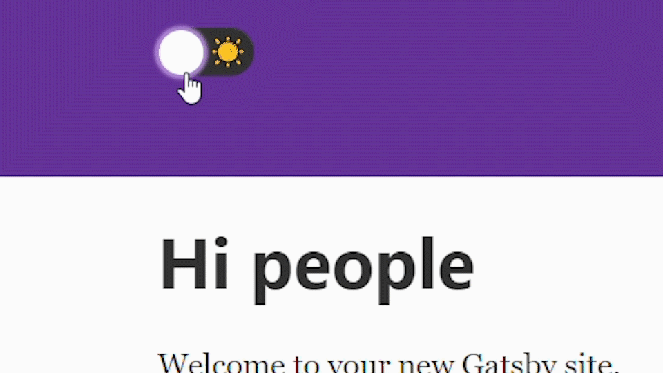
)Try it out!
Styling the Toggle Switch
You can customize the style of the Switch using special props. Here’s the styling I used - feel free to download the icons from the github repo or substitute the <img> tags with emojis.
import sunIcon from "../images/sun-icon.svg"
import moonIcon from "../images/moon-icon.svg"<Switch
onChange={() => theme.updateTheme(theme.name === "light" ? "dark" : "light")}
checked={theme.name === "dark"}
onColor="#222"
offColor="#333"
checkedIcon={<img src={moonIcon} alt="moon icon" />}
uncheckedIcon={<img src={sunIcon} alt="sun icon" />}
boxShadow="0 0 2px 3px #B38CD9"
activeBoxShadow="0 0 2px 3px #dfb3e6"
/>Thanks for reading, hopefully this project helps illustrate some of the potential for using Context and CSS-in-JS with Gatsby.
As I noted at the top, if you’re looking to persist the theme across sessions, consider checking out this discussion and this Gatsby plugin.